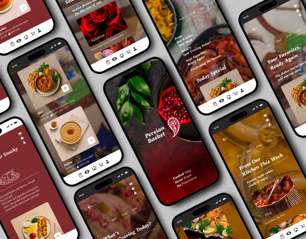
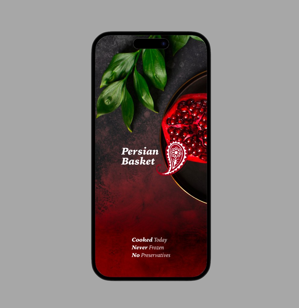
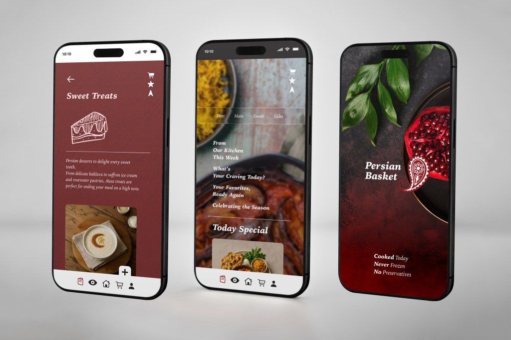
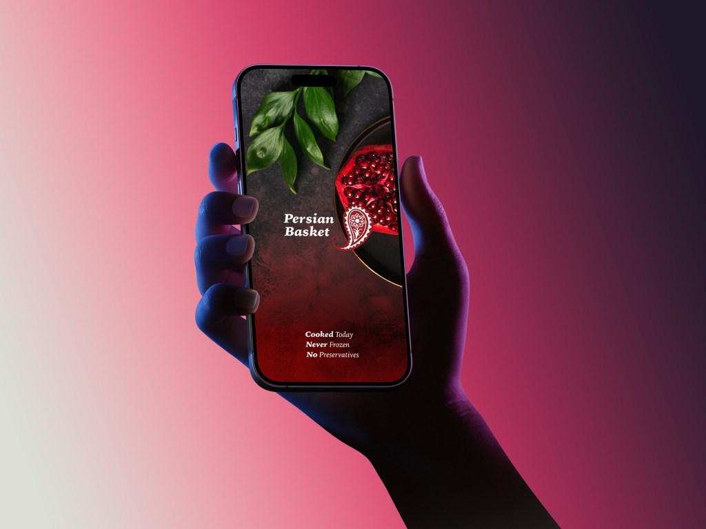
Persian Basket – Bringing Persian Flavors to Your Fingertips
Persian Basket is a conceptual food delivery and ready-to-eat meal app designed to connect people with authentic Persian cuisine in a modern, effortless way. Built for busy individuals and families, the app simplifies the process of discovering, ordering, and enjoying traditional meals—without compromising on freshness or cultural authenticity.
With a clean, intuitive interface, curated menus, and filters for dietary preferences and allergies, Persian Basket makes it easy to explore Persian flavors while fitting seamlessly into everyday life. From classic stews and grilled kebabs to vegetarian and gluten-free options, the app delivers convenience with cultural depth. Whether planning a family dinner, a quick lunch, or a healthy meal on the go, Persian Basket ensures that Persian cuisine is only a few taps away.
My Role:
UX/UI Design · User Research · Wireframing · Prototyping · Visual Design
Tools Used:
Figma · FigJam · Miro · Photoshop . Illustrator . zoom
Timeline:
6 Weeks
The Problem:
Most food delivery apps overwhelm customers with:
- Most food delivery apps make ordering harder instead of easier. They overwhelm users with cluttered menus, endless options, and hidden fees that create frustration. For people who are busy, health-conscious, or craving authentic cultural food, this experience feels stressful instead of enjoyable.
What’s missing is simplicity, transparency, and cultural authenticity. Users need an app that feels personal—one that offers curated Persian meals, clear pricing, and options for different dietary needs, without the noise and hassle. Instead of just being another food app, Persian Basket should feel like a trusted kitchen—bringing convenience, clarity, and genuine Persian flavors straight to the table.
The Solution:
Persian Basket introduces a user-centered food ordering experience through:
- Instead of overwhelming customers with cluttered menus, hidden fees, or endless steps, the app focuses on clarity and comfort. From the first tap, users can search or browse meals effortlessly, with transparent pricing and clear delivery options.
- Ordering is straightforward, and dietary preferences1 or allergies can be added without hassle. Small touches, like clean visuals, curated meal categories, and clear checkout summaries, help customers feel in control and confident in their choices.
Design Process:
Empathize
・User Interviews ・User Research ・Competitor Analysis
Define
・Affinity Mapping ・User Personas ・Empathy Mapping
Ideate
・User Flows ・Task Flows ・Wireframes
Design
・Mid- to High-Fidelity Mockups ・UI Design ・Interactive Prototypes
Test
・Usability Testing ・Feedback Synthesis ・Design Iteration
Understanding
Visualizing the Emotional Journey
Mapping a persona’s journey in the Persian Basket app revealed key insights: many users hesitate when ordering because menus feel overwhelming, prices and portions aren’t always clear, and dietary filters (like vegetarian, halal, or allergy-friendly) are often missing or hidden. At the same time, small wins—like seeing a clear price breakdown, being able to filter for food preferences, or getting quick delivery updates—make users feel more confident and engaged.
These insights highlighted the need for clarity, personalization, and trust. Persian Basket should feel less like a crowded online market and more like a smart, reliable companion—making food ordering intuitive, transparent, and culturally inclusive.
“68% of Millennials and Gen Z diners say they’ve abandoned a food delivery order because the menu felt confusing or allergy options weren’t visible.”
(APA, 2023)
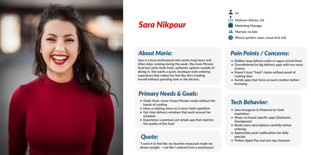
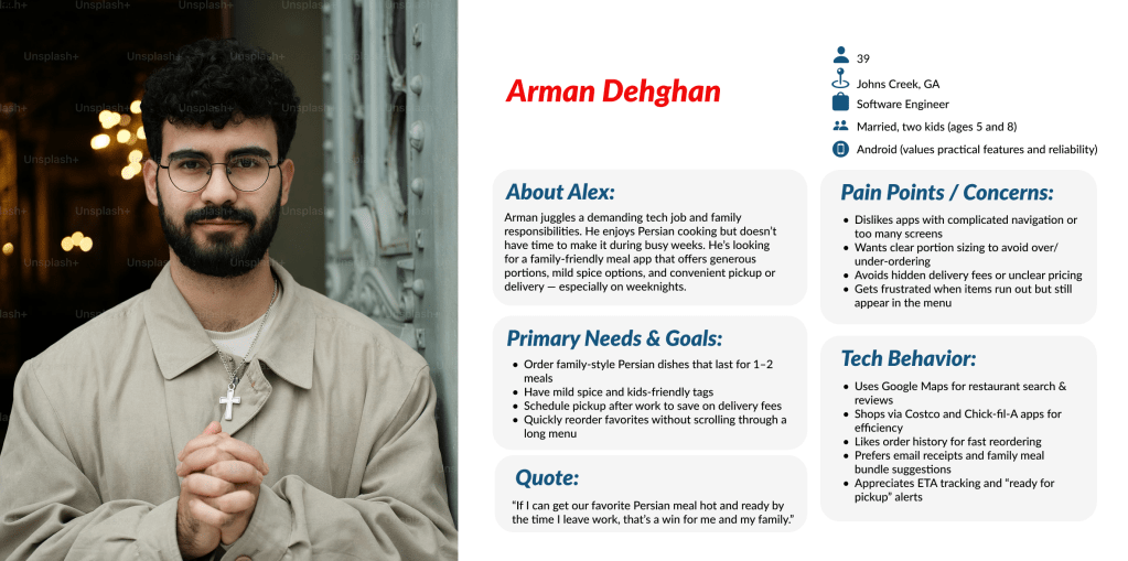
Target Users:
For the Persian Basket app, I focused on adults between the ages of 24 and 45—a group that includes busy professionals, young families, and second-generation immigrants who want authentic Persian flavors but have little time to cook. These users often juggle demanding schedules, balancing work, family, and social life, which makes convenience and trust essential in their food choices.
They value clarity, authenticity, and personalization. Instead of long, confusing menus, they want curated options that highlight fresh, ready-to-eat meals, with clear pricing and visible dietary filters (vegetarian, halal, gluten-free, allergy-friendly).
Quick decisions are key for this group—being able to select a dish, customize portions, and pay seamlessly resonates more than navigating cluttered ordering systems.
This audience expects flexibility and reliability: whether it’s planning a weekday dinner, ordering last-minute for guests, or discovering healthier Persian-inspired meals, they want an app that adapts to their lifestyle and provides food they can trust.
Researching What Users Say
To better understand the mindset and daily habits of Persian Basket’s target users, I conducted interviews with six participants who fit the profile—busy adults looking for convenient, authentic meals without the hassle of cooking. These conversations revealed how people currently order food, what challenges they face with delivery apps, and where existing platforms fall short.
The insights highlighted recurring pain points: users dislike cluttered menus, hidden fees, and lack of clear labeling for dietary needs. They often want Persian-inspired meals that are both quick and trustworthy, but feel most apps don’t provide enough transparency or cultural authenticity.
Here are a few key findings:
4 out of 6 participants said they felt misled by hidden fees or unclear delivery times, leading them to abandon the checkout process.
83% of participants said they often abandon orders when apps feel too cluttered or confusing, making them frustrated instead of saving time.
67% actively look for clear dietary filters like vegetarian, halal, or allergy-friendly before making a choice.
50% expressed concern about portion sizes and freshness, but rarely found apps that highlight this upfront.
Affinity Mapping: From Friction Points to Solutions
I used an affinity diagram to cluster user frustrations, needs, and behaviors into clear themes. Starting with the question, “How might we design a food app that feels simple, transparent, and culturally authentic?”, we grouped notes around clarity, trust, and convenience.
This process transformed scattered pain points—like hidden fees, unclear dietary filters, and confusing checkout—into actionable design directions. The result helped shape the Persian Basket app into a platform that emphasizes straightforward ordering, clear food information, and a stress-free experience for busy users.
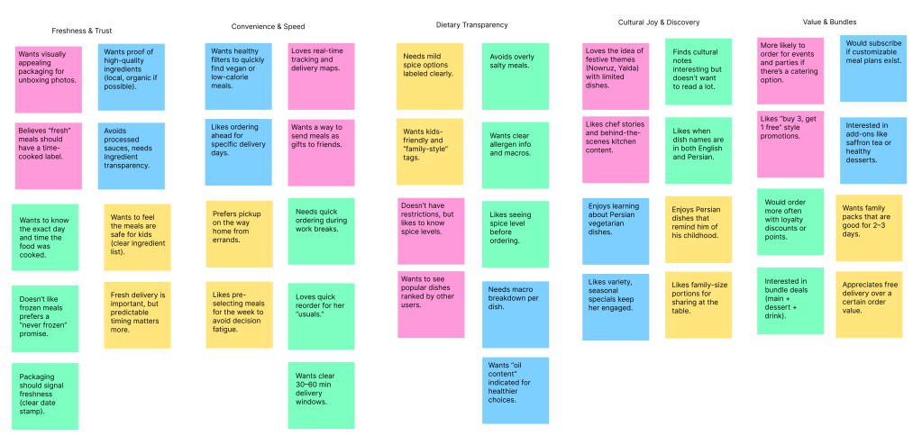
From Pain Points to Opportunities
By mapping recurring issues—like confusing checkout flows, missing allergy filters, and unclear delivery options—I could visually identify patterns. I then explored how other food delivery and grocery apps handled similar challenges, set creative constraints, and used brainstorming methods like the idea wall to generate solutions.
This process revealed one key opportunity: “Building trust through clear simplicity.” Persian Basket would communicate prices, ingredients, and delivery details upfront—helping users feel confident, in control, and supported when ordering meals, without the stress of hidden steps or uncertainty.
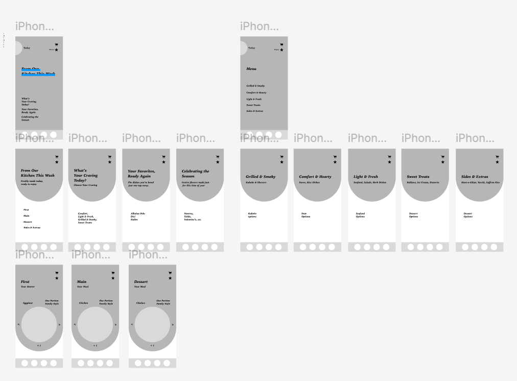
Wireframe
This wireframe illustrates the initial concept of the user experience for Persian Basket’s meal ordering flow. The focus was on simplifying essential actions—like browsing ready-to-eat meals, checking clear pricing and ingredients, and selecting dietary or allergy preferences—while avoiding clutter and confusion.
At this stage, the goal was to define a clean, intuitive flow that reflects user priorities: speed, clarity, and confidence. The wireframe served as a foundation for early testing, ensuring the design aligned with real customer needs before moving into polished high-fidelity visuals.
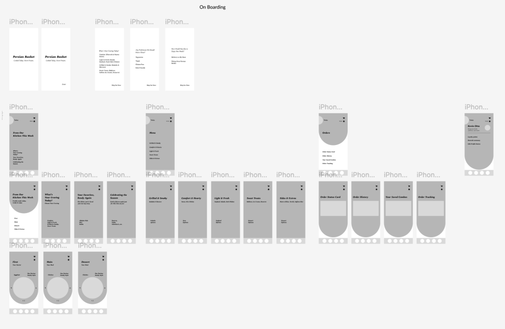
Structuring the Experience with User Flows and Mental Models
User Flows and Mental Models
For Persian Basket, I began by identifying core meal-ordering tasks that reflect how users naturally shop for food—browsing ready-to-eat meals, checking ingredients, customizing for dietary needs, and completing a quick, seamless checkout. These priorities were organized into a clear sitemap, balancing user needs for speed and transparency with the business goal of building trust and repeat engagement.
From there, I created user flows grounded in real-life shopping scenarios. Each flow mirrors how someone might enter the app—whether they’re looking for a quick dinner, exploring healthier meal options, or ordering ahead for the week—and ensures that Persian Basket meets them with clarity, choice, and efficiency.
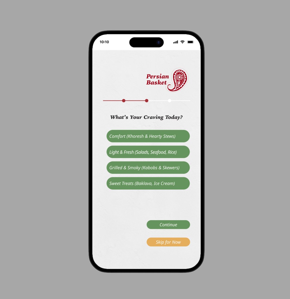
For example, Key Flow 1: Selecting a Meal and Customizing Dietary Preferences illustrates how users can quickly browse, filter by dietary needs or allergies, and see transparent pricing before checkout. This flow supports our goal of making Persian Basket feel accessible, intuitive, and user-first, while reinforcing confidence through a smooth, trustworthy experience.
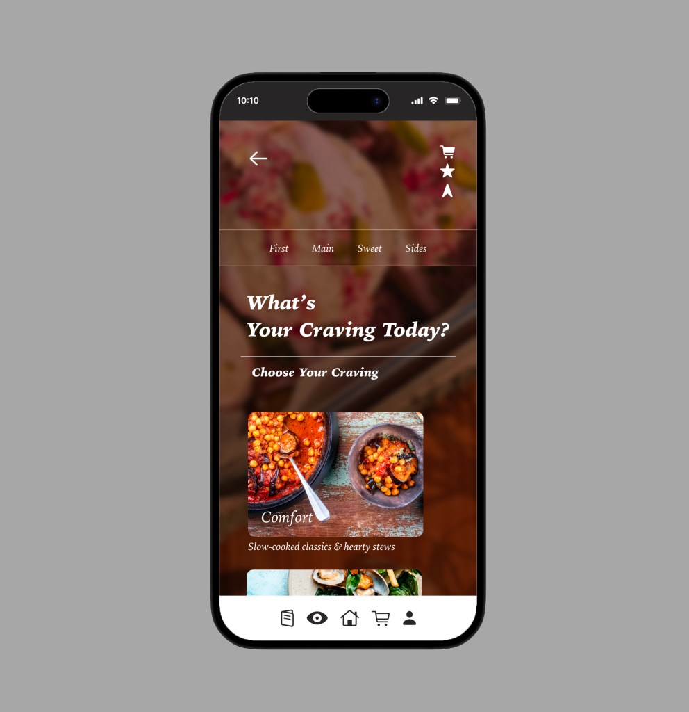
Key Flow 2: Choosing a Meal with Personalization
In the Persian Basket app, users can explore ready-to-eat meals based on their cravings and dietary needs. After a quick preference check-in—such as mood, dietary restrictions, or portion size—the app suggests options like hearty stews, light salads, or comforting rice dishes. Each meal can be customized by spice level or paired with sides, creating a flexible, personalized experience that feels both authentic and supportive of daily routines.
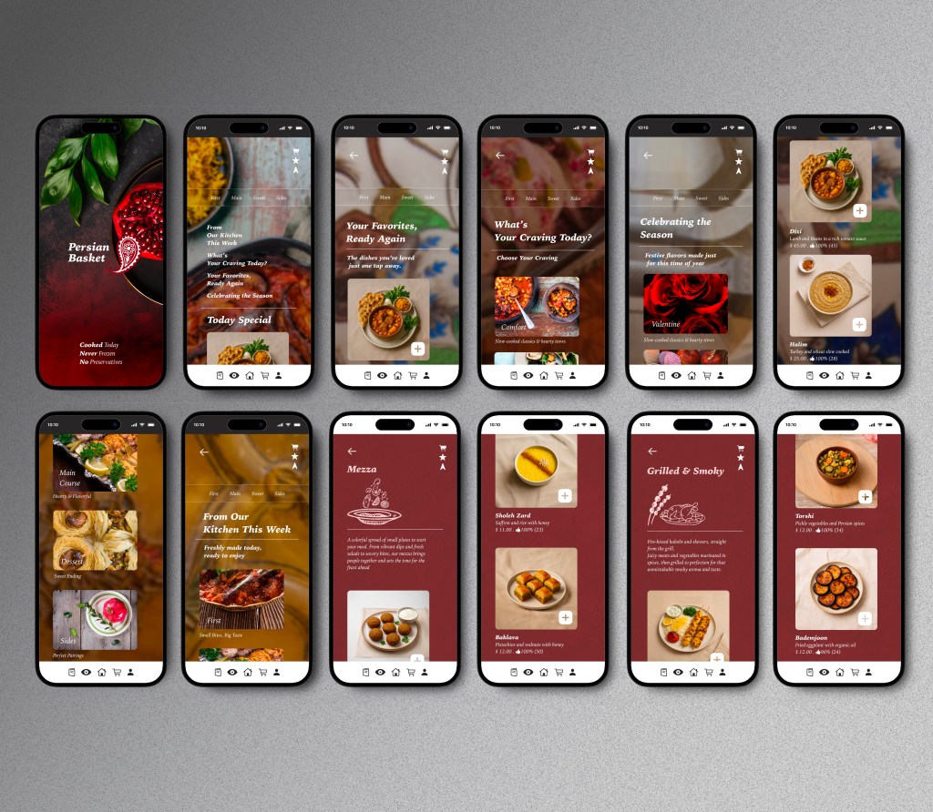
HIGH FIDELITY
By developing a high-fidelity prototype for the Persian Basket app, I was able to evaluate the interface, visual hierarchy, and core shopping interactions in a realistic setting before moving toward development. This stage helped uncover usability issues early—such as navigation clarity, checkout flow, and product detail presentation—while giving room to refine design choices like typography, imagery, and cultural touches. The process ensured a smoother, more intuitive user experience that reflects Persian Basket’s brand values. In the end, the prototype saved valuable time and resources by minimizing rework and aligning the design closely with customer needs and expectations.
Test Phase – Methodology
To validate the Persian Basket app design, I conducted remote usability testing with 5 participants via Zoom. Each session was moderated and screen-recorded to capture authentic interactions, focusing on key shopping tasks such as browsing products, adding items to the cart, and completing checkout.
Task timing was measured with a mobile stopwatch to ensure consistency across participants and to identify friction points—like hesitation during product filtering or confusion at checkout. Reviewing the recordings afterward revealed specific usability challenges, such as button placement, visual hierarchy, and clarity of product information.
Findings were organized in a feedback matrix, categorized by type (navigation, content, or visual clarity) and severity. An affinity map highlighted recurring themes across users—such as the need for clearer cart updates, smoother category browsing, and more reassuring confirmation steps.
Finally, I used a severity vs. frequency framework to prioritize fixes, ensuring that the most impactful improvements (like simplifying checkout and clarifying shipping options) were addressed first. This structured testing process provided actionable insights that brought the app closer to a seamless, user-centered shopping experience.
TESTED FLOWS
・Browse categories and filter meals/products to find desired items
・Review a clear pricing and delivery breakdown before checkout
・Customize meal options (portion size, add-ons, or dietary preferences)
・Complete checkout with minimal steps and clear progress indicators
・Access order confirmation and delivery tracking from the mobile dashboard
REFLECTION
Outcomes
Since Persian Basket is currently a conceptual project, no live development has taken place. However, the design process created a strong foundation for understanding how customers shop for ready-to-eat meals and groceries. Research and usability testing highlighted the importance of clarity in pricing and delivery, intuitive product discovery, and the ability to personalize meals to dietary needs. The project reinforced that reducing friction during checkout and building trust with transparency are essential for creating a loyal customer experience.
If I had more time
I would expand the research to include a broader range of customers—such as families managing weekly groceries, older adults seeking convenience, and users with accessibility needs. I would also refine the onboarding flow to better introduce app features and explore additional capabilities like meal subscriptions, personalized recommendations, and loyalty rewards. These features would strengthen long-term engagement while staying true to the project’s core values of simplicity, trust, and cultural authenticity.
