PeachJet – Designing a Better Way to Fly
PeachJet is a conceptual airline app designed to simplify the flight booking experience for busy travelers. Built with a user-first mindset, the project focuses on reducing friction during onboarding, flight search, seat selection, and checkout. The clean interface and intuitive interactions aim to make planning a trip as smooth as the journey itself.
My Role:
UX/UI Design · User Research · Wireframing · Prototyping · Visual Design
Tools Used:
Figma · FigJam · Miro · Photoshop . Illustrator . zoom
Timeline:
5 Weeks
The Problem:
Many existing airline apps overwhelm users with:
- Cluttered layouts and confusing navigation
- Lack of clear pricing (hidden fees, unclear fare classes)
- Missing or hard-to-find filters for non-stop flights
- No upfront info on food options or allergy considerations
- Unclear seat layout and upgrade options
These issues cause frustration and delay decision-making, especially for users with time constraints, specific dietary needs, or low tech tolerance.
The Solution:
PeachJet introduces a user-centered booking experience through:
- Streamlined Flight Filters Users can easily select non-stop only, preferred departure windows, and airlines—all from a clean filter interface.
- Transparent Pricing Fare breakdowns, bag fees, and upgrade costs are shown clearly before checkout—no surprises.
- Personalized Food Preferences During booking, users can choose meals based on dietary needs (e.g., vegetarian, gluten-free, nut-free), visible per flight.
- Visual Seat Selection An interactive seat map lets users preview legroom, amenities, and costs—making informed choices effortless.
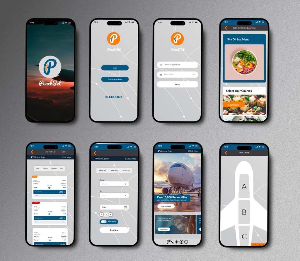
- Simple, Elegant UI A light, peach-toned interface with intuitive steps reduces overwhelm and creates a sense of calm throughout the process.
Design Process:
Empathize
・User Interviews ・User Research ・Competitor Analysis
Define
・Affinity Mapping ・User Personas ・Empathy Mapping
Ideate
・User Flows ・Task Flows ・Wireframes
Design
・Mid- to High-Fidelity Mockups ・UI Design ・Interactive Prototypes
Test
・Usability Testing ・Feedback Synthesis ・Design Iteration
Understanding
Visualizing the Emotional Journey
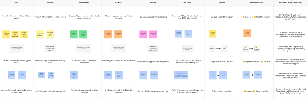
To understand users’ emotional flow while booking a flight, I created an experience map that followed a key persona’s journey—from opening the app to confirming their booking. This helped surface emotional highs and lows throughout the process.
The map revealed moments of frustration around unclear pricing, anxiety about food allergies on long flights, and uncertainty when comparing nonstop vs. layover options. Users also felt overwhelmed by cluttered interfaces and hidden fees.
These insights highlighted where travelers lose trust or get stuck—and helped me focus the design on clarity, simplicity, and transparency.
“72% of Millennial and Gen Z travelers prioritize transparency in pricing and food options when booking flights—significantly higher than 54% of Gen X and only 39% of Baby Boomers.”
(Condor Ferries, 2024)
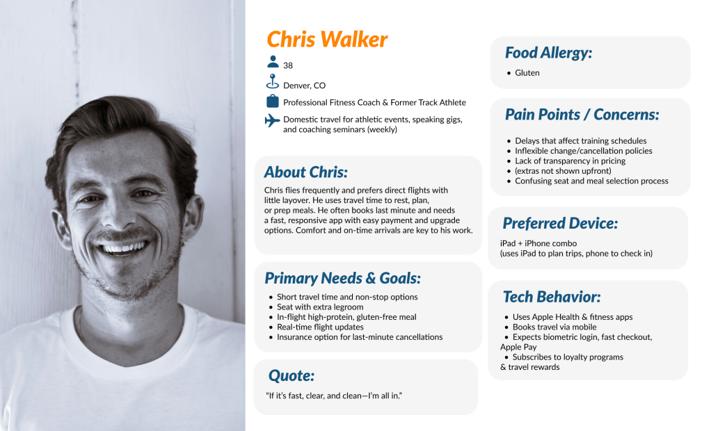
Target Users:
For PeachJet, I focused on travelers between the ages of 24 to 38—a group that includes both Gen Z and younger Millennials. These users are digitally native, budget-conscious, and highly sensitive to transparency and personalization when it comes to booking flights. They prioritize non-stop flights, clear pricing, and options for dietary needs.
This group values efficiency and clarity, often using mobile devices for last-minute bookings, and expects a stress-free experience from search to seat selection.

Researching What Travelers Say
To better understand the mindset and habits of this demographic, I conducted interviews with 6 participants who fit the target user profile. These interviews provided key insights into how people make travel decisions and what pain points they experience during the booking process.
Here are a few key findings:
- 83% of participants said they often abandon booking due to unclear pricing or hidden fees.
- 67% actively seek non-stop flights and filter them first before checking other details.
- 50% expressed concern about food and allergy options but rarely found this information before booking.
- 4 out of 6 participants said they felt “rushed” or “confused” by the cluttered interfaces of current airline apps.
Affinity Mapping: From Friction Points to Solutions
To organize user insights, I created an affinity diagram using color-coded sticky notes, grouping frustrations, needs, and behaviors. I started with the question: “How might we simplify flight booking for young, mobile-first travelers?”
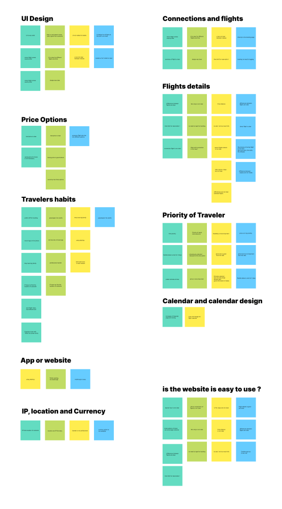
By mapping recurring pain points—like unclear pricing, limited food info, and overwhelming flight options—I could visually identify patterns. I explored how other travel apps solve similar issues, set creative constraints, and used the idea wall method to generate potential solutions.
This process led to one key opportunity area: “Unlocking confidence through transparency”—a system that clearly communicates prices, flight details, and in-flight services from the very beginning.
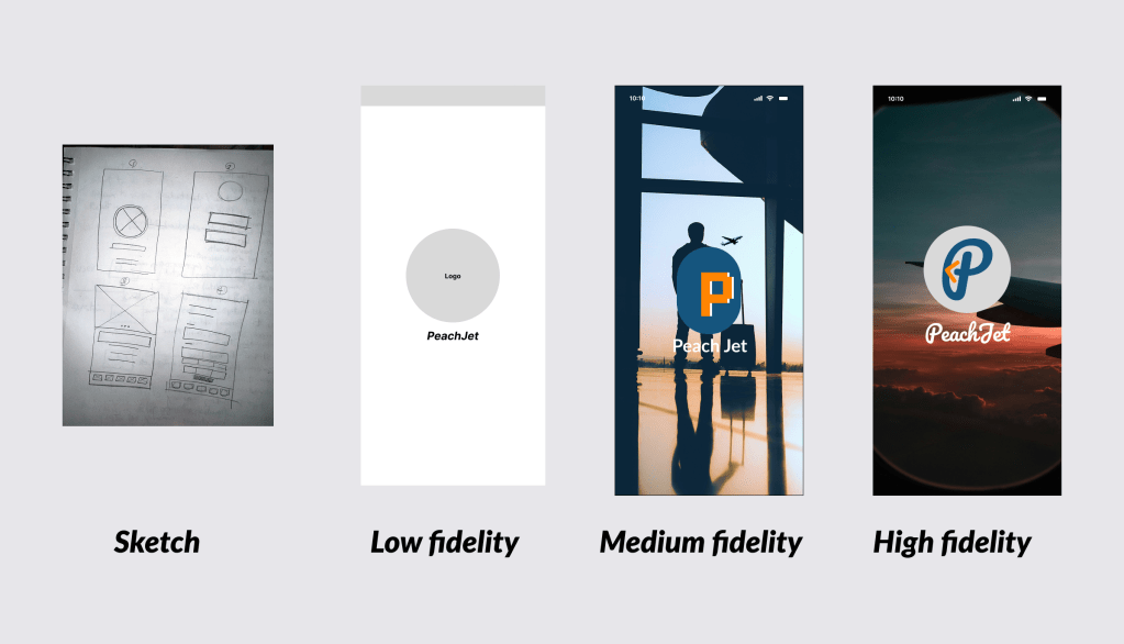
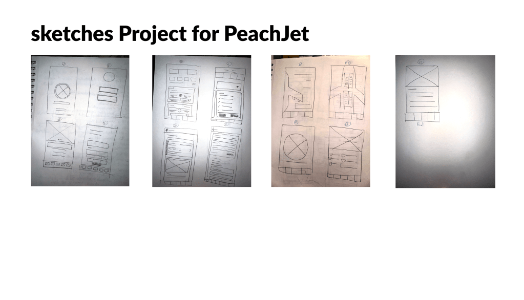
Wireframe
This wireframe represents the initial concept of the user experience during the flight booking process in the PeachJet app. It focuses on streamlining key actions—such as selecting non-stop flights, viewing clear pricing, and customizing in-flight preferences—while minimizing cognitive load.
The goal at this stage was to establish a simple, intuitive flow that aligns with user priorities: speed, clarity, and control.
Structuring the Experience with
User Flows and Mental Models
Building on research insights and idea generation, I identified core user tasks and mapped them into features that reflect both user priorities and business objectives. I structured this information into a clear, intuitive sitemap aligned with the behaviors of our primary personas, while keeping in mind technical constraints and mobile-first usability.
From there, I defined the main pathways travelers would follow through the PeachJet platform. Each flow was created to reflect a real travel scenario, the decisions it requires, and how the interface can support those moments with clarity and ease.
Key Flow 1: Booking a Non-Stop Flight with Transparent Pricing
Key Flow 2: Selecting a Seat with Food Preferences and Allergy Filters
Key Flow 3: Easy Seat Selection and a Clear, Hassle-Free Checkout
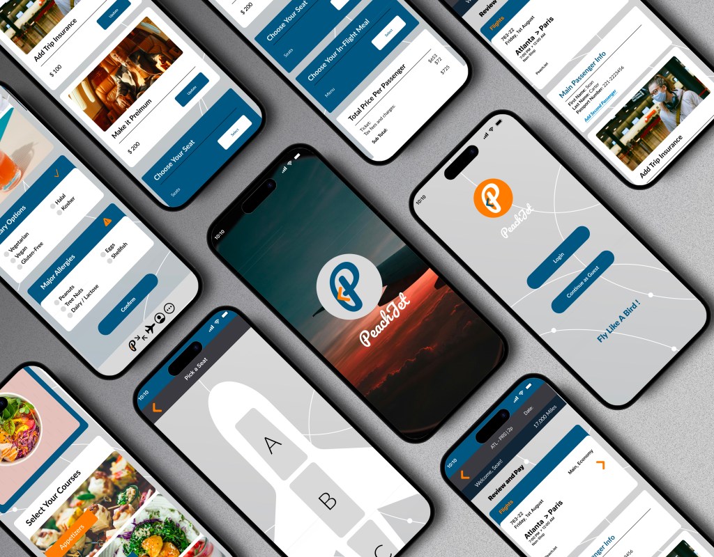
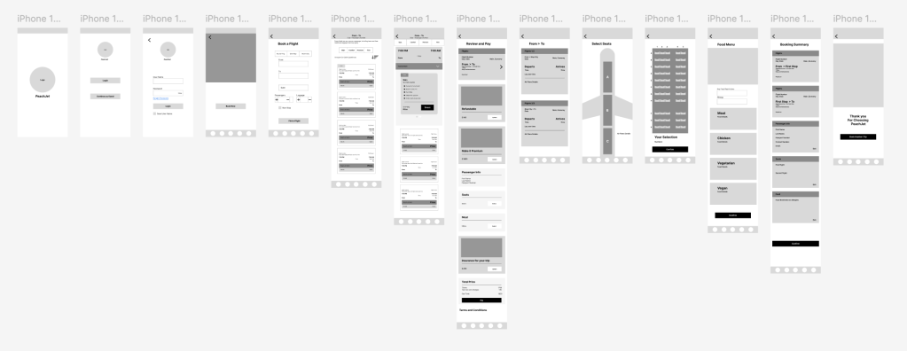
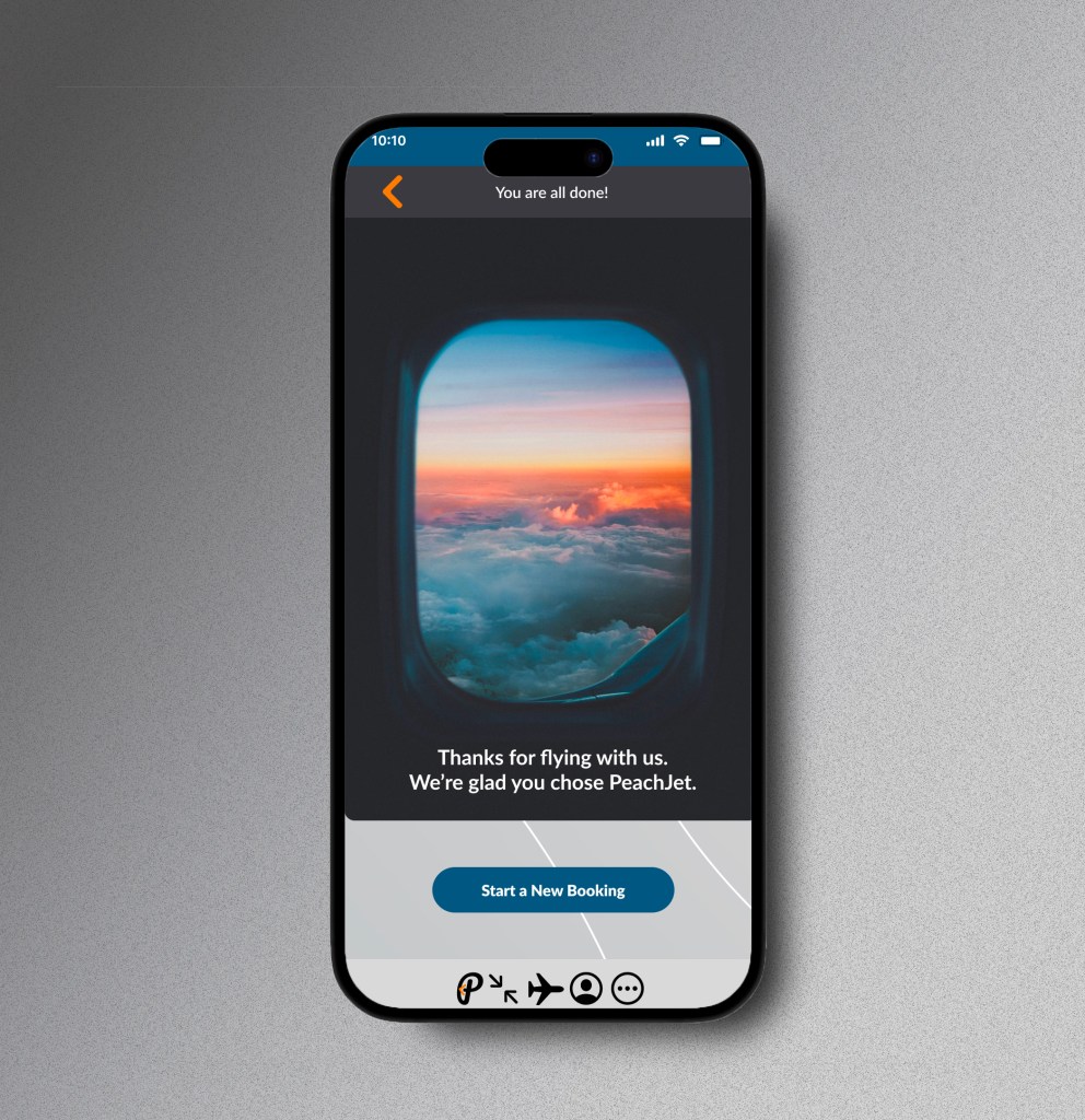
HIGH FIDELITY
By creating a high-fidelity prototype of the PeachJet app, I was able to thoroughly test the interface, visual hierarchy, and key interactions before development. This allowed me to spot usability issues early, refine design decisions, and ensure a smooth, user-centered experience—saving valuable time and effort down the line.
TEST PHASE
METHODOLOGY
Remote testing: All 5 participants completed moderated usability tests via Zoom.
Device-based timing: Each task was timed using a mobile stopwatch to ensure consistency and highlight potential friction points.
Observation & insights: Screen recordings were reviewed and analyzed to identify usability challenges and moments of confusion.
Feedback matrix: A feedback grid was used to categorize insights by type and severity.
Theme discovery: An affinity map was created to uncover patterns across user behavior and expectations.
Prioritization framework: A severity vs. frequency matrix helped prioritize high-impact improvements for the next design iteration.
TESTED FLOWS
・Book a non-stop flight using filters
・Understand pricing breakdown before checkout
・Select a seat and view food/allergy options
・Complete booking with minimal steps
・Access confirmation and trip details via mobile dashboard
REFLECTION
Outcomes
Since PeachJet is a conceptual project, no live development has taken place yet. However, the design process allowed me to explore real user needs and build a strong foundation for a potential future product. The feedback received during testing affirmed the value of focusing on transparency, simplicity, and personalization in the flight booking experience.
If I had more time
I would conduct additional rounds of user research—particularly with international travelers and users with accessibility needs—to uncover further opportunities for improvement. I’d also refine the onboarding flow and explore how loyalty programs or travel bundles could be integrated to enhance user retention and engagement.
