
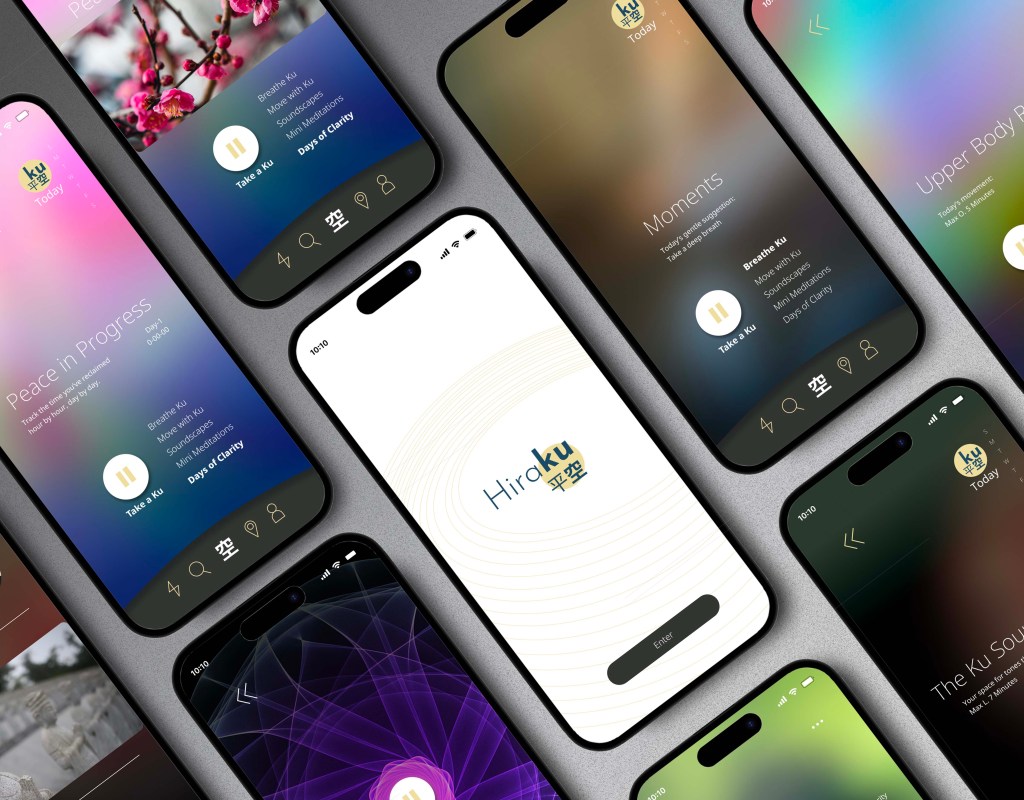
Hiraku – Redefining Mental Wellness with Subtlety and Care
Hiraku is a conceptual mental wellness app designed for busy adults who seek balance without stigma. Built around empathy and user research, the app avoids heavy “self-help” branding and instead focuses on gentle daily rituals, casual check-ins, and non-judgmental support. With a clean interface, soft visuals, and flexible features like anonymous use and quick mood resets, Hiraku empowers users to build healthier habits and emotional clarity—one small step at a time.
My Role:
UX/UI Design · User Research · Wireframing · Prototyping · Visual Design
Tools Used:
Figma · FigJam · Miro · Photoshop . Illustrator . zoom
Timeline:
5 Weeks
The Problem:
Many existing mental wellness apps overwhelm users with:
- Most wellness apps make things harder instead of easier. They ask too many questions at the start, push rigid routines, and flood users with notifications that end up feeling like pressure. For people already stressed, burned out, or quietly trying to change unhealthy habits, this creates guilt instead of support.
What’s missing is simplicity, empathy, and a safe space that feels like a guide—not a therapist. Users need something gentle, personal, and stigma-free that helps them take small steps without judgment.
The Solution:
PeachJet introduces a user-centered booking experience through:
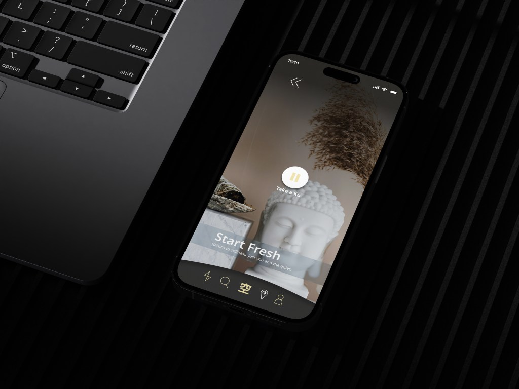
- Hiraku was designed to be calm, simple, and stigma-free. Instead of overwhelming users with long forms or rigid routines, it welcomes them with gentle onboarding and flexible paths they can choose for themselves. Daily check-ins feel more like conversations than tasks, while small, visual nudges, like soft animations and progress reflections, help users see growth without pressure.
- The app also builds in subtle support for breaking unhealthy habits, offering tools like breathing guides, mood tracking, and quiet journaling that feel approachable rather than clinical. By focusing on empathy, personalization, and a light touch, Hiraku gives people a safe space to reset, reflect, and grow at their own pace.
Design Process:
Empathize
・User Interviews ・User Research ・Competitor Analysis
Define
・Affinity Mapping ・User Personas ・Empathy Mapping
Ideate
・User Flows ・Task Flows ・Wireframes
Design
・Mid- to High-Fidelity Mockups ・UI Design ・Interactive Prototypes
Test
・Usability Testing ・Feedback Synthesis ・Design Iteration
Understanding
Visualizing the Emotional Journey
Mapping a persona’s journey in Hiraku revealed key insights: users often feel hesitant during onboarding, overwhelmed by cluttered interfaces, and anxious about rigid tracking. At the same time, small wins—like a quick breathing exercise or a gentle reflection—build trust and motivation.
These insights showed us the need for stigma-free design, subtle guidance, and flexibility, so Hiraku feels more like a safe companion than a clinical tool.
These insights highlighted where users need gentle guidance, stigma-free design, and flexible choices. It reinforced the need for Hiraku to feel like a safe companion—soft, approachable, and built around personalization instead of pressure.
“63% of Gen Z and Millennials report using wellness apps for stress relief, but only 29% stick beyond the first week—citing overwhelming interfaces and lack of personalization as the main reasons.”
(APA, 2023)
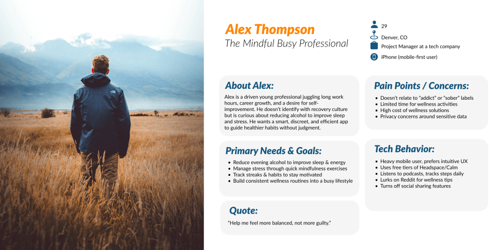
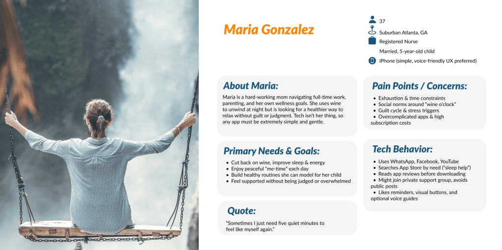
Target Users:
For Hiraku, I focused on adults between the ages of 21 and 45—a group that spans late Gen Z, Millennials, and younger Gen X. These users often juggle busy lifestyles, careers, or family responsibilities and may feel stressed, burned out, or caught in unhealthy habits—but don’t always identify with labels like “mental health” or “sobriety.”
They value subtle, stigma-free support that feels approachable rather than clinical. Quick wins, like short breathing exercises, casual mood check-ins, or light journaling prompts, resonate more than rigid tracking systems.
This group prefers flexibility, empathy, and personalization, expecting tools that adapt to their needs—whether that’s winding down before bed, staying mindful during the day, or exploring healthier habits without pressure.
Researching What Users Say
To better understand the mindset and daily habits of Hiraku’s target users, I conducted interviews with six participantswho fit the profile—busy adults navigating stress, burnout, and lifestyle challenges. These conversations revealed how people currently approach mental wellness, what tools they’ve tried, and where existing apps fall short.
The insights highlighted recurring pain points: users dislike rigid tracking, avoid apps that feel overly clinical, and often look for subtle support without labels or pressure. They want flexibility, approachable design, and guidance that feels more like a companion than a therapist.
Here are a few key findings:
83% of participants said they often stop using wellness apps because they feel too clinical or overwhelming, making them anxious instead of calm.
67% actively look for short, non-intrusive practices like breathwork or quick check-ins rather than long sessions.
50% expressed concern about food, sleep, or lifestyle triggers, but rarely found tools that helped them connect these patterns to their mental state.
4 out of 6 participants said they felt “pressured” or “guilty” when apps used streaks or rigid reminders, leading them to uninstall after a few days.
Affinity Mapping: From Friction Points to Solutions
I used an affinity diagram to cluster user frustrations, needs, and behaviors into clear themes. Starting with the question, “How might we create a wellness app that feels supportive without pressure?” we grouped notes around guidance, personalization, and simplicity.
This process turned scattered pain points into actionable design directions—helping shape Hiraku into a calm, stigma-free experience.
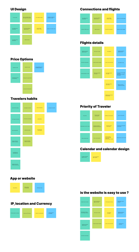
From Pain Points to Opportunities
By mapping recurring issues—like cluttered flows, unclear guidance, and pressure-filled wellness prompts—I could visually identify patterns. I then explored how other mental wellness apps approached similar challenges, set creative constraints, and used the idea wall method to brainstorm potential solutions.
This process revealed one key opportunity: “Unlocking confidence through gentle transparency.” Hiraku would clearly communicate progress, options, and support tools from the start, helping users feel safe, in control, and understood without stigma or overwhelm.
Wireframe
This wireframe illustrates the initial concept of the user experience for PeachJet’s flight booking flow. The focus was on streamlining essential actions—like choosing non-stop flights, viewing transparent pricing, and customizing in-flight preferences—while reducing unnecessary complexity.
At this stage, the goal was to define a simple, intuitive flow that reflects user priorities: speed, clarity, and control. The wireframe served as a foundation for testing ideas early, ensuring the design aligned with real user needs before moving into high-fidelity visuals.

Structuring the Experience with User Flows and Mental Models
User Flows and Mental Models
For Hiraku, I started by identifying core wellness tasks that reflect how users naturally approach self-care—things like checking in with their mood, exploring calming exercises, or reflecting on daily habits. These priorities were mapped into a clear sitemap, balancing user needs for simplicity with the business goal of long-term engagement.
From there, I built user flows grounded in real-life wellness scenarios. Each flow mirrors how someone might arrive in the app—whether they’re feeling stressed, curious, or simply checking in—and ensures that Hiraku meets them with gentle guidance and choice, not pressure.
For example, Key Flow 1: Logging a Mood Check-in and Receiving Personalized Suggestions illustrates how users can quickly record their state of mind, then seamlessly discover tailored tools like breathing exercises or journaling prompts. This flow supports our goal of making Hiraku feel responsive, safe, and stigma-free, while reinforcing progress through subtle, encouraging feedback.
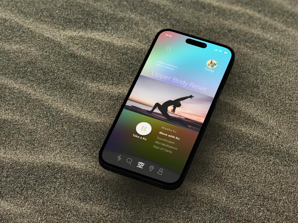
Key Flow 2: Choosing a Breathing Exercise with Personalization
In Hiraku, users can select a breathing exercise based on how they feel. After a quick check-in, they see tailored options—like calming, energizing, or balancing breathwork. They can adjust by time length or add soothing sounds, making each session feel personal and supportive.
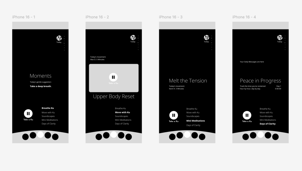
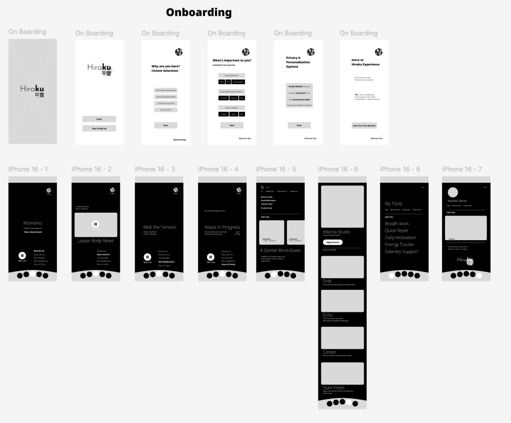
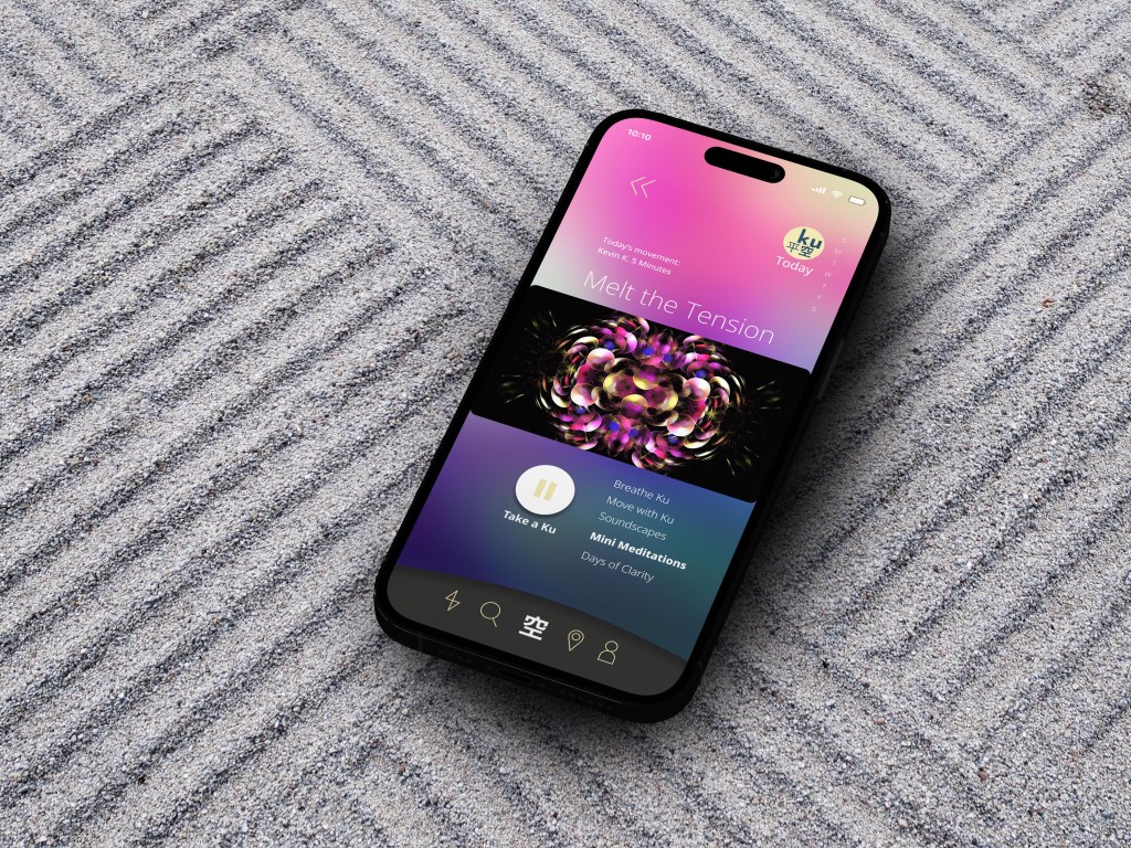
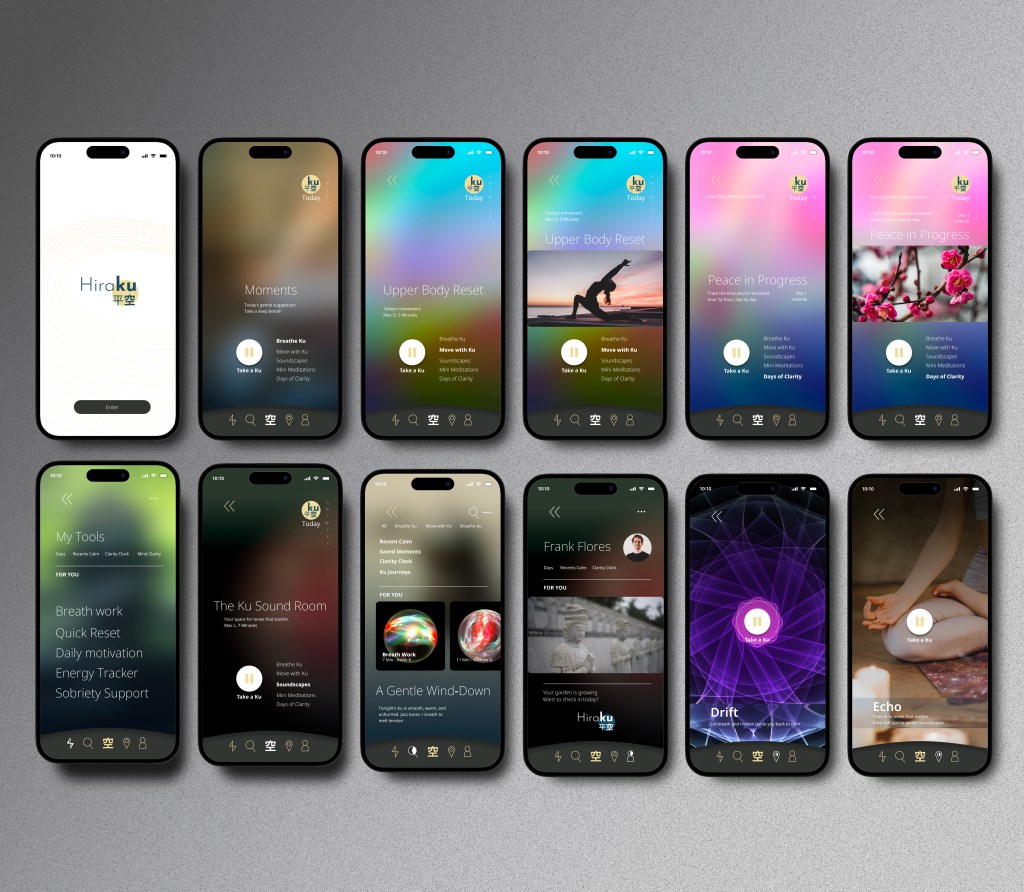
HIGH FIDELITY
By developing a high-fidelity prototype of the app, I was able to test the interface, visual hierarchy, and core interactions in a realistic context before moving into development. This process revealed usability issues early, gave space to refine design decisions, and ensured a smoother, more user-centered experience. In the end, the prototype saved valuable time and resources by reducing rework and aligning the design closely with user needs.
Test Phase – Methodology
METHODOLOGY
To validate the design, I conducted remote usability testing with 5 participants using Zoom. Each session was moderated and screen-recorded to capture authentic interactions and behaviors.
Task timing was measured with a mobile stopwatch to ensure consistency across participants and to highlight moments of friction or hesitation. Afterward, I carefully reviewed the recordings to surface usability challenges and points of confusion.
Insights were organized using a feedback matrix, which categorized findings by type (e.g., navigation, content, visual clarity) and severity. I then created an affinity map to identify recurring themes across participants, such as clarity, flow, and emotional response.
Finally, a severity vs. frequency framework helped prioritize which issues should be addressed first in the next design iteration—ensuring the highest-impact improvements were implemented quickly and effectively.
TESTED FLOWS
・Book a non-stop flight using filters
・Review a clear pricing breakdown before checkout
・Select a seat and explore food/allergy options
・Complete booking with minimal steps
・Access confirmation and trip details from the mobile dashboard
REFLECTION
Outcomes
Since PeachJet is a conceptual project, no live development has taken place. However, the design process provided a clear opportunity to understand real traveler needs and translate them into actionable design decisions. Through research and usability testing, I learned how much users value transparency in pricing, intuitive navigation, and the ability to personalize their journey. The project reinforced the importance of reducing friction and building trust early in the booking process.
If I had more time
I would expand research to include a wider variety of travelers, especially international passengers and those with accessibility needs, to ensure inclusivity. I’d also refine the onboarding flow to make it even more welcoming and explore additional features like loyalty programs, bundled travel services, and dynamic recommendations. These additions could help drive long-term engagement while staying true to the project’s core values of clarity, simplicity, and personalization.
